Color Contrast: Fixing the Wheel
At 4/19/2024
More recently than I’d like to admit, our team began incorporating color contrast checks into our process. This fundamentally changed the way we approach color in our design systems.
To show what I mean, here’s a basic RGB color wheel that covers #ff0000 to #0000ff:
If we run those colors through a contrast checking tool, we’ll discover that half of the wheel won’t work for text (with white as the foreground or background):
Okay, no big deal. We can use a tool like Tanaguru Contrast Finder to recommend the nearest accessible color, updating our wheel accordingly:
Bleh. Although the whole wheel is now usable for text, we’ve lost all our bright oranges, yellows and greens… colors that can give our work a sense of energy and life. Does this mean we’re stuck with only blues, purples, reds and browns?
Thankfully not!
Palettes With Purpose
The key to rescuing our oranges and yellows from the mud is to acknowledge that different hues can and should fill different needs.
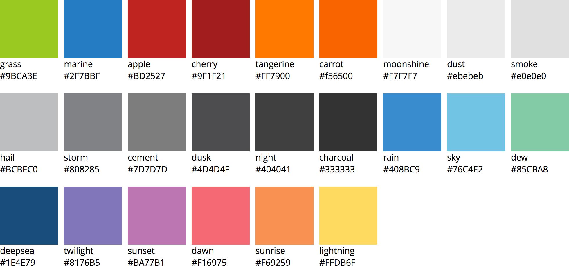
I’ve certainly been guilty of presenting color palettes in broad groups of primary and secondary swatches, but those labels fail to describe where a color will or won’t succeed. Well-meaning designers and developers will either inadvertently apply them in an inaccessible way, or ignore the more troublesome values altogether.

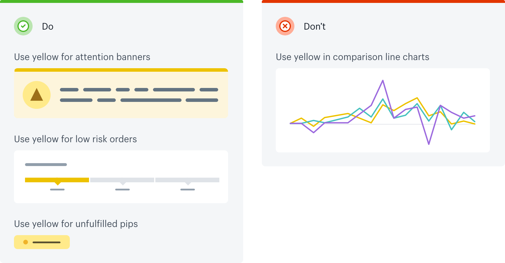
So to reclaim the warmer half of our color wheel, we must clearly define the role of each hue. Which are suitable for text? Which are suitable for backgrounds? Which pair well with each other? Which should only be used for visual accents?


Chromatic Content
Some interfaces don’t naturally lend themselves to visual accents. In those cases, it’s especially critical to coordinate color usage between UI design and content. If yellow is important to your brand but there’s no place for it in your interface, then it must be accounted for in your illustration, photography and/or video guidelines.

Staying Disciplined
As a designer, this process can seem pretty frustrating at first. There’s a whole spectrum of amazing colors out there, and it can feel uncreative to constrain ourselves. Worse still are the times when palettes are foisted upon us without any prior thought to accessibility. Faced with the challenge of re-thinking something as fundamental as a color palette, it can be tempting to sweep contrast issues under the rug… especially when so many websites seem content to ignore them.
But contrast is essential for readability! It doesn’t matter how attractive your color combinations are if users can’t perceive them. By incorporating accessibility guidelines and design intent into our color palettes, we can thoughtfully use any color we want wherever it will be most inclusive.
