CSS Circles
At 4/19/2024

I’m Cloud Four’s resident expert on circles.
I didn’t plan to be. A while back, we worked on a project that involved a lot of circles… circular containers, circular thumbnails, circular buttons. Before I knew it, I became the guy to talk to if you were having trouble with circles and CSS.
But I’ll let you in on a secret: There’s not a lot to know. By the end of this article, I have a feeling you’ll be an expert, too.
Making Circles
There are several techniques for defining dynamic circular shapes in HTML and CSS, each with pros and cons. Here are the few I’ve experimented with the most, from most common to least.
Border Radius
The most common technique is to round all corners by 50%. This is the simplest to apply, and is very widely supported. The border-radius property will also affect borders, shadows and the element’s touch/click target size.
If you want the circle to stretch to a pill shape, set border-radius to half the element’s height instead of 50%. If the height is unknown, pick some arbitrarily large value (for example, 99em).
SVG
SVGs can include a <circle/> element, which may be styled similarly to any other path. They are very well supported and performant to animate, but they require more markup than other techniques. To prevent visual clipping of the shape, make sure the circle’s radius (plus half its stroke width, if any) is slightly smaller than the SVG’s viewBox.
Clip Path
Clip paths are a newer technique. Support is decent but less consistent. Clip paths do not impact the element’s layout, which means they will not affect borders and will likely hide outer shadows. This can be good or bad depending on what you’re trying to accomplish.
Radial Gradient
We can use background-image and radial-gradient to visually fill an element with a circle. Any content will sit on top of that shape, but its layout (including touch/click target size) will be unaffected. This is my least favorite technique because the circle’s edges may appear jagged or fuzzy depending on the browser, but it may be a good fit for subtle background accents.
Centering Content
Just about any technique for centering things with CSS may be used. But sometimes you may notice content that appears very slightly misaligned. While not unique to circular containers, their reduced surface area makes the problem extra noticeable.

This is due to the way browsers calculate sub-pixels. Any time we use relative units, viewport units or values from a modular scale, chances are we’re asking the browser to calculate fractional values like 22.78125px. Back in the day, this problem would break our grids or cause other fundamental issues. These days, browsers work very hard to vary their calculations depending on the element, property and context, but it isn’t perfect.
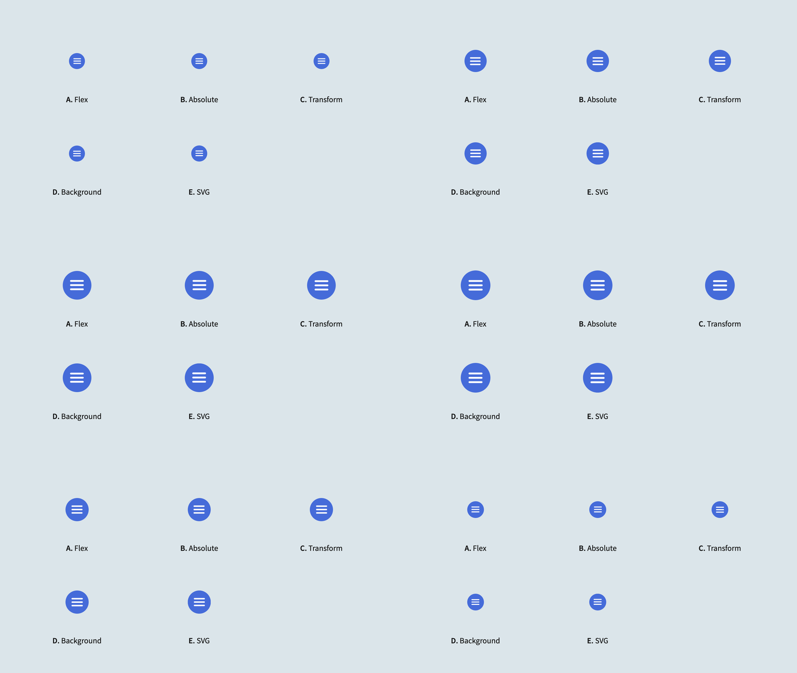
In my experience, the most resilient and flexible method for centering uses a combination of absolute positioning (to establish a center point based on the parent element’s layout) and a transform (to place the child element with fuzzier math):
Cropping Content
Centering is fine and all, but what if we want imagery to fill a circle?
With HTML/CSS
We can crop an <img> element to a circle using border-radius:
This has some limitations, though:
- The element is not responsive to its container.
- We can’t apply any inner shadows to help offset the image from its background (except in the image itself).
- We’re using
object-fit: coverto prevent distortion of non-square images, but that isn’t supported in IE11.
Here’s a more elaborate example. It uses a wrapper element to establish an aspect ratio box for maintaining square proportions responsively, it enhances the handling of non-square images via @supports, and it applies a transparent inner shadow to offset the image from its background:
With SVG
We can accomplish the same thing using SVG:
But since SVG image elements don’t support srcset or sizes, this is probably a poor choice for a general-use image thumbnail pattern.
Sub-pixel Gaps
If you layer inner shadows, borders or other fancy-ness on top of circular content, you may eventually notice some sub-pixel artifacts bleeding through:

Unfortunately, I haven’t found a solution for this issue. It seems to occur regardless of the technique used to draw the border or display the image, and it occurs to some degree in every browser.
If you find a way of layering circular effects without these artifacts, please let me know in the comments!
Wrapping Text
Text! It’s the foundation of the web. It digs rectangles and breaking onto new lines. What can we do about that?
Outside Text
You can make outside text wrap around a floating circular shape using the shape-outside property:
Inner Text
Stop! This is probably a bad idea! It’s almost impossible to make responsive! Just wait till we have a shape-inside property!
Unconvinced? Okay, fine, Jonathan Skeate has a clever hack for us. It uses pseudo elements to set shape-outside on either side of the text content:
Along a Path
We can set text to a curved path with SVG and <textPath>:
Unfortunately, <circle> isn’t supported for <textPath> in all browsers, but converting to a <path> isn’t too strenuous.
Congratulations!
You’ve done it! You found an overly long article about a truly pedestrian topic, navigated its minefields of nested headings and repetitive demos, and emerged triumphant with a burdensome knowledge of circles as your only reward! Go forth, intrepid reader, and vanquish whatever corner-less beasts lie ahead. You can do it! I believe in you! 🙌
