Generating complementary gradients with CSS filters
At 4/19/2024
CSS filters unlock powerful new opportunities for playing with color. By applying a little color theory we can dynamically generate harmonious color combos and gradients.

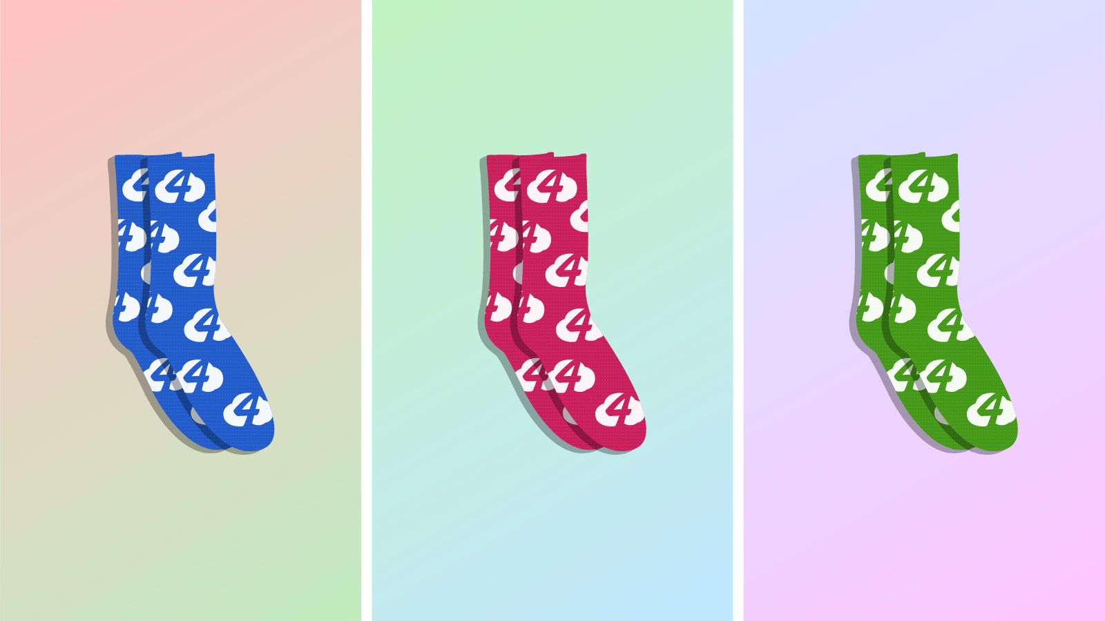
Imagine you’re a developer working at the Cloud Four Sock Store™. You’re tasked with designing a new product page to sell their amazing socks in a wide range of colors. You receive an illustration of the socks, but there’s a catch: It doesn’t have a background.
That won’t do at all… if people are going to buy these socks, they’ve really gotta pop! So grab a cup of coffee, lower your standing desk, and pull up an exercise ball: We’ve got some gradients to generate!
Constraints
Our boss lets us know about some constraints up-front:
- The current sock color will be available via a
--product-illustrationcustom property. - The solution has to work for any arbitrary sock color. You never know when the Cloud Four Sock Store™ is going to release a new color!
- If you don’t need to use JavaScript, don’t! Keep your bundle size down and your page loads snappy.
- It’s gotta look good! No one’s gonna buy your socks if they don’t look good!
Playing with opacity
Let’s try lowering the opacity of the sock color for our background…
.product-illustration {
  /**
   * Ensure the transparent background is always on
   * plain white
   */
  background: #fff;
  position: relative;
}

/**
 * Use the `::before` pseudo element for our
 * colored background.
 */
.product-illustration::before {
  content: "";
  /* Make sure it covers the whole sock illustration */
  position: absolute;
  bottom: 0;
  top: 0;
  left: 0;
  right: 0;
  /* Match the sock color */
  background: var(--illustration-color);
  /* But make it transparent */
  opacity: 0.3;
}
Code language: CSS (css)
This works out okay but it’s not quite there. There’s not a lot of contrast between the socks and their background:
hue-rotate
Using a complementary color with hue-rotate
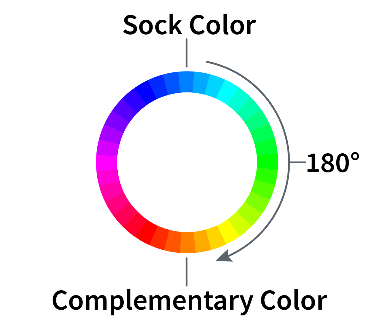
Maybe we could use a complementary color instead. By picking two colors that are on opposite sides of the color wheel we can generate a lot of contrast between them while making sure it’s pleasing to the eye.

Since there are 360 degrees in the color wheel rotating the hue of the sock color by 180 degrees will get us the color on the opposite side of the color wheel. This can be achieved with the hue-rotate CSS filter.
.product-illustration::before {
  filter: hue-rotate(180deg);
}
Code language: CSS (css)
We can play around with the saturate, brightness, and opacity filters to really make this pop:
.product-illustration::before {
  filter: hue-rotate(180deg) saturate(300%) brightness(120%) opacity(25%);
}
Code language: CSS (css)Now we’re getting somewhere! But I wonder if we could make it look even better…
Using two split-complementary colors
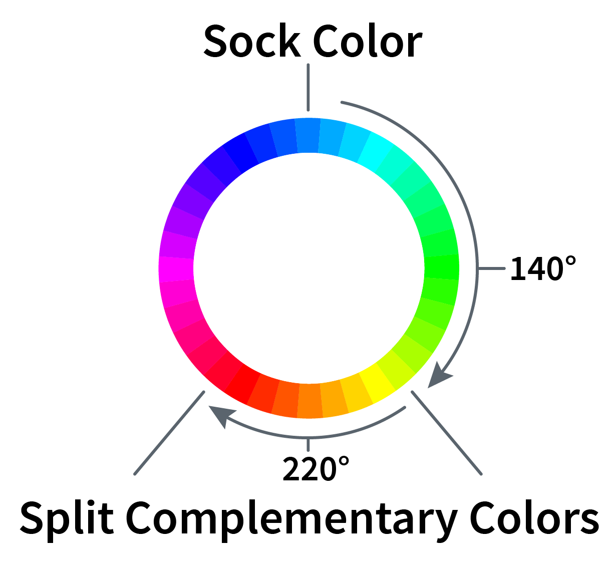
What if we used a split-complementary color scheme? These color schemes use two colors equal distances from a complementary color:

Could we generate a gradient between the two split-complementary colors and use that as a background?
We can use filters to fetch two colors 40 degrees from the complementary color: hue-rotate(220deg) and hue-rotate(140deg). However, CSS gradients require two colors, not two filters. There’s no good way for us to plug the CSS filtered colors into the gradient. I’m stumped. You might want to grab another cup of coffee…
Aha! What if we could create 2 overlapping gradients and apply the different filters to the different gradients?
/**
 * Use the ::before and ::after pseudo elements for
 * your two gradients
 */
.product-illustration::before,
.product-illustration::after {
  position: absolute;
  content: "";
  height: 100%;
  width: 100%;
  left: 0;
  top: 0;
  /**
   * Add a gradient transitioning from the illustration color
   * to complete transparency
   */
  background: linear-gradient(
    /* Rotate it 30 degrees so it feels less rigid */ -30deg,
    var(--illustration-color),
    rgba(255, 255, 255, 0)
  );

  /* Store filters we'll apply to both gradients */
  --base-filters: saturate(300%) brightness(120%) opacity(25%);
}

.product-illustration::before {
  /* Apply your first filter to your ::before pseudo-element */
  filter: hue-rotate(220deg) var(--base-filters);
}

.product-illustration::after {
  /* Apply your second filter to your ::after pseudo-element */
  filter: hue-rotate(140deg) var(--base-filters);
  /**
   * Rotate the second gradient 180 degrees so it comes from
   * the opposite side
   */
  transform: rotate(180deg);
}
Code language: CSS (css)
Your backgrounds look great! Cloud Four Sock Store™ sells a million pairs of socks and you get a raise! You retire early and go live in the Bahamas!
Other use cases
Obviously this is a made-up story, but it helps showcase a cool use case for CSS filters. This could be enhanced further by exploring other color schemes or layering more gradients.
I used this recently when designing a product page but there are a lot of potential uses with dynamic content. I’m excited to keep playing with this and exploring CSS filters!
