
Progressively Enhanced Form Validation, Part 1: HTML and CSS
At 4/19/2024

Browsers nowadays have built-in form validation (or “constraint validation”) features that are super helpful for highlighting when the entered data satisfies the necessary criteria. Some of us have relied on JavaScript-only solutions to handle client-side form validation in the past (/me slowly raises hand…), but as it turns out, most of these built-in features have been around for over a decade!
HTML5 introduced new mechanisms for forms: it added new semantic types for the
MDN Constraint Validation docs<input>element and constraint validation to ease the work of checking the form content on the client side. Basic, usual constraints can be checked, without the need for JavaScript, by setting new attributes; more complex constraints can be tested using the Constraint Validation API.
Join along as we explore progressively enhancing the form validation experience through a series of articles. Starting with the browser’s built-in validation features using HTML and CSS, then layering JavaScript for more enhancements, each successive article will build on the previous.
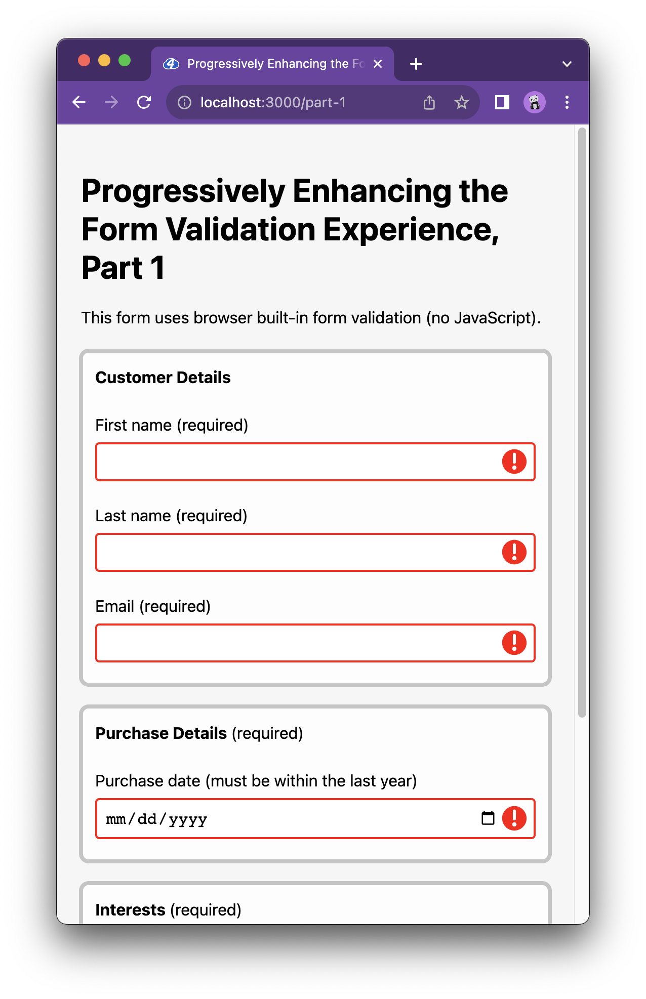
Feel free to view this article’s accompanying demo as a reference. The source code is available on GitHub.
I’m excited and hope you are too. Let’s dive into the foundation of any website: HTML and CSS.
Browser built-in form validation as the foundation
Native form validation features can validate most user data without relying on JavaScript. These features provide the strong foundation required for building a progressively enhanced experience.
Let’s take a closer look at each feature.
type attributes
Input type attributes
It starts with choosing the most semantically appropriate value for the input type attribute (e.g., type="email").
<label for="customer-email">Email</label>
<input
  id="customer-email"
  name="customerEmail"
  type="email"
/>
Code language: HTML, XML (xml)Extra validation attributes
Other validation attributes can be added to layer more constraints (e.g., required, min/max, minlength/maxlength, pattern, etc.).
<label for="customer-email">
  Email <span aria-hidden="true">(required)</span>
</label>
<input
  id="customer-email"
  name="customerEmail"
  type="email"
  required
  minlength="2"
/>
Code language: HTML, XML (xml)CSS pseudo-classes
Value-checking pseudo-classes are available to help style form controls. Depending on your site’s design, you may not need all of them, but it’s good to know they exist.
Validity pseudo-classes
To highlight valid or invalid fields.
Optionality pseudo-classes
To highlight required fields (specified by a required attribute) and optional fields (fields with no required attribute).
Range pseudo-classes
To highlight fields within or outside of the range limits specified by the field’s min/max attributes.
User-interaction pseudo-classes
To highlight valid or invalid fields after the user has interacted with the field.
Error message bubble
When a form is submitted, the browser automatically shows error messages in a “bubble” next to the first form control where the input data does not satisfy the form control’s validation constraints. The message and design of the bubble will differ from browser to browser. The styles of the error bubble cannot be modified, providing a consistent browser-specific user experience. However, this can also be a negative as the bubble design may not fit the site’s aesthetics.

How to avoid invalid styles showing on page load
One of the pushbacks against using browser built-in form validation is that invalid styles are applied on page load before the user interacts with the form controls. I agree. This creates a confusing user experience.
No worries, though, :user-invalid/:user-valid to the rescue!
These CSS pseudo-classes can progressively enhance the user experience in browsers that support them. In contrast to :invalid/:valid, using the :user-invalid/:user-valid pseudo-classes will apply the styles only after the user has interacted with the form control.
No more invalid UI styles on page load!
To support all modern browsers and apply :user-invalid/:user-valid in a progressively enhanced manner, the CSS could look something like this:
/**
 * For browsers that support :user-invalid/:user-valid
 */
input:user-invalid {
  /* Invalid input UI styles */
}
input:user-valid {
  /* Valid input UI styles */
}

/**
 * When not supported, fallback to :invalid/:valid
 * Wrapping :valid/:invalid in a "not" @supports block ensures
 * that the invalid styles are not applied on page load in browsers
 * that do support :user-invalid/:user-valid
 */
@supports not selector(:user-invalid) {
  input:invalid {
    /* Invalid input UI styles */
  }
  input:valid {
    /* Valid input UI styles */
  }
}Code language: CSS (css)
We can see the differences when viewing the Part 1 demo:
- In browsers that support
:user-invalid(e.g., new versions of Firefox and Safari), we’ll notice invalid styles do not get applied until after we interact with and move away from (blur) the form control. - In browsers that do not support
:user-invalid(e.g., Chrome, though they are looking to ship support soon!), we’ll notice the invalid styles are applied when the page loads before we interact with the form controls.
What if I need IE support?
The @supports CSS at-rule is supported in all modern browsers. But if the project needs to support IE, we’ll want to style the :invalid/:valid CSS rules outside the @supports block and then unset those styles inside the @supports block.
Browser built-in validation doesn’t do everything
As with all things, there are always pros and cons. Let’s take a quick step back to review a few pros and cons of using browser built-in validation as the foundational base user experience.
Pros
- No JavaScript is required!
- No need to write custom validation logic
- Can handle the majority of validation use cases
- The validation errors are automatically rendered and styled by the browser providing a consistent browser-specific experience
- Validation error messages are localized automatically
Cons
- The error messages are not customizable (without JS)
- The error message bubble design may not fit the overall site design
- The
:invalidstyles are applied before the user has a chance to fill out the form field in browsers that do not support:user-invalid - Some form controls (e.g., a
checkboxgroup) cannot be validated - Safari has a few open
:user-invalidrelated bugs (three open tickets as of this article’s publish date) - Web Content Accessibility Guidelines (WCAG) 2.1 Success Criterion (SC) violations:
- SC 1.3.1: Info and Relationships (Level A) – The validation error message is not associated with the field in error
- SC 1.4.4: Resize Text (Level AA) – The error message bubble text does not resize
- SC 1.4.12: Text Spacing (Level AA) – The error message bubble text does not respect text spacing styles
- SC 2.2.1: Timing Adjustable (Level A) – There is no control over the timing of the error message bubble, and in most cases, it disappears too quickly (Chromium is considering closing an open issue that should absolutely be addressed, “star” the issue and show support!)
- SC 3.3.1: Error Identification (Level A) – The field in error is not identified
- SC 3.3.2: Labels or Instructions (Level A) – The reason for the error is not always clear
- SC 3.3.3: Error Suggestion (Level AA) – The error message may not always be clear or provide a helpful suggestion
Thank you to Juliette Alexandria and Adrian Roselli for providing feedback and resources regarding WCAG violations for native browser validation features. Your feedback is greatly appreciated. 🙌🏽
Can the experience be enhanced and made more accessible?
You bet it can! We can address all of these cons by layering a bit of JavaScript combined with some ARIA attributes. We can build a progressively enhanced, more accessible experience on top of the native HTML & CSS validation features.
This is a fantastic example of how progressive enhancement shines. We provide a baseline user experience without JavaScript. The enhanced version builds on an already established foundation. We no longer need to rely on JavaScript-only solutions.
In the following article of this series, we’ll explore all of this, building out from where the Part 1 demo left off. See you there!
More resources
- Avoid Default Field Validation by Adrian Roselli
- MDN Web Docs: Input pseudo-classes
Missed an article in the series?
I’ve got you! Listed below are all of the articles from the series: