Shifty Tile Flyouts
At 4/19/2024
Although my favorite projects will always be those that allow us to re-evaluate a user experience from the ground up, sometimes that isn’t realistic. That’s where Responsive Retrofitting comes in: The process of making small, surgical changes to existing interfaces to improve the small-screen experience incrementally.
Each and every retrofit is a little different, but patterns do emerge. In the past couple of years, I’ve noticed one particularly challenging bit of UI that’s cropped up multiple times for multiple clients.
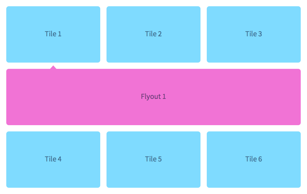
Here’s how it works: We have tiles separated into rows and columns. Each tile represents some form of summary content; contact info or payment options, for example. Selecting a tile (or clicking an “edit” button therein) expands a flyout below with some sort of form content, which spans the entire available width and “pushes” down any tiles below.
Every time I’ve encountered this, it’s been implemented in the same way. Because the design is fixed-width, the number of columns in each row is predictable. Flyout elements are simply inserted between rows:
<div class="Tiles">
  <div class="Tile">
    <div class="Tile-content">
      Tile 1
    </div>
  </div>
  <div class="Tile">
    <div class="Tile-content">
      Tile 2
    </div>
  </div>
  <div class="Tile">
    <div class="Tile-content">
      Tile 3
    </div>
  </div>
  <div class="Tile">
    <div class="Tile-content">
      Tile 4
    </div>
  </div>
  <div class="Flyout is-open js-flyout">
    <div class="Flyout-content">
      Flyout 1
    </div>
  </div>
  <div class="Flyout Flyout--2of4 js-flyout">
    <div class="Flyout-content">
      Flyout 2
    </div>
  </div>
  <div class="Flyout Flyout--3of4 js-flyout">
    <div class="Flyout-content">
      Flyout 3
    </div>
  </div>
  <div class="Flyout Flyout--4of4 js-flyout">
    <div class="Flyout-content">
      Flyout 4
    </div>
  </div>
  <div class="Tile">
    <div class="Tile-content">
      Tile 5
    </div>
  </div>
  <div class="Tile">
    <div class="Tile-content">
      Tile 6
    </div>
  </div>
  <div class="Flyout js-flyout">
    <div class="Flyout-content">
      Flyout 5
    </div>
  </div>
  <div class="Flyout Flyout--2of4 js-flyout">
    <div class="Flyout-content">
      Flyout 6
    </div>
  </div>
</div>Code language: Handlebars (handlebars)
See the Pen Shifty Tiles: Part 1 by Tyler Sticka (@tylersticka) on CodePen.
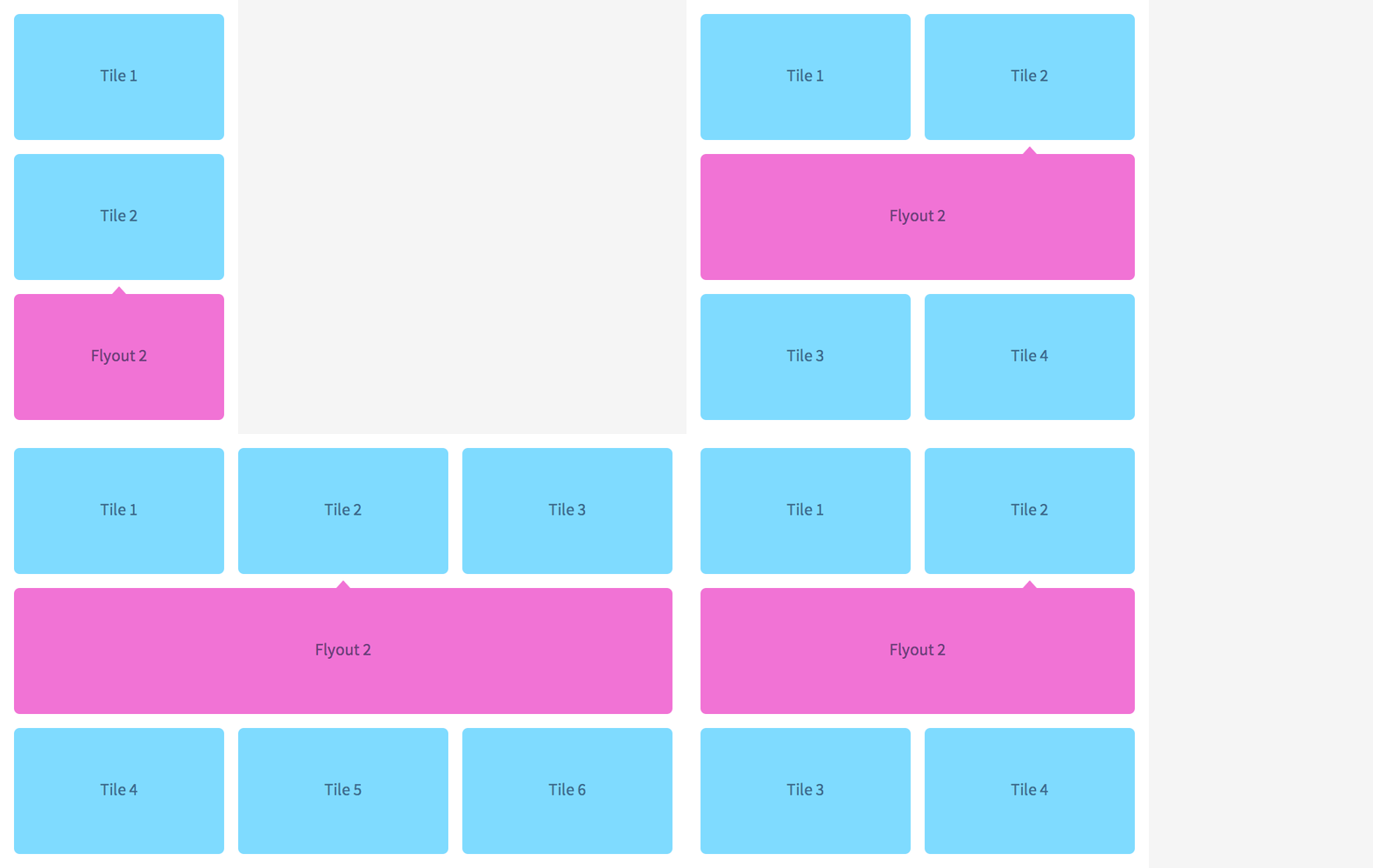
The content order’s pretty messed up, but it works as intended. Or it would have, if it hadn’t been for that meddling Ethan Marcotte and those media queries of his. When you throw responsive into the mix, that predictable column count we depended on goes right out the window:
We could listen to resize events and move the flyouts around with JavaScript. But you and I both know that’s a bad idea. Let’s see how we can solve this problem with CSS alone, maybe even improving the content order along the way.
To Float or Not To Float
If we revise our markup so that the tiles and flyouts are unified (instead of separated by arbitrary “rows”), we’ll discover that the floats we were using to arrange tiles side-by-side do not handle change well. Depending on which tile flyout is expanded, subsequent tiles attempt to float around it, resulting in an inconsistent (and frankly, upsetting) experience for wider viewports:
See the Pen Shifty Tiles: Part 2 by Tyler Sticka (@tylersticka) on CodePen.
Well that’s it, then! Floats don’t work, we need tiles to float, time to throw in the towel and handle this with JavaScript.
Not so fast!
Instead of floating the tiles, we can steal borrow a technique from the SUIT CSS grid component and use display: inline-block instead. Combined with vertical-align: top, the tallest tile in a row should push down everything beneath it (just like a tall image in a line of text would affect adjacent rows).
Let’s give it a whirl:
See the Pen Shifty Tiles: Part 3 by Tyler Sticka (@tylersticka) on CodePen.
Success! Even as flyouts shove their way between rows, the tiles retain their horizontal position.
But those flyouts are still awfully narrow at larger sizes. Let’s fix that.
Breaking Out
Our goal is for the flyouts to occupy 100% of the available width across all viewports. So far, they’re only ever as wide as the tiles themselves. If we’re decreasing tile widths at larger breakpoints, we should also increase flyout widths by the same factor.
If you’re using a preprocessor like Sass and you hate solving the same math problems over and over as much as I do, now’s a great time to write a mixin to handle this logic across multiple breakpoints:
@mixin generate-tile-grid($columns) {
  .Tile {
    // divide the available width by the number of columns
    width: (100% / $columns);
  }

  .Tile-flyout {
    // extend beyond the tile width by the same factor
    width: (100% * $columns);
  }

  .Tile-flyout:before {
    // adjust the position of the flyout caret
    left: (100% / 2 / $columns);
  }
}

@media (min-width: 30em) {
  @include generate-tile-grid(2);
}

/* etc. */
Code language: CSS (css)
Here’s where that gets us:
See the Pen Shifty Tiles: Part 4 by Tyler Sticka (@tylersticka) on CodePen.
So close! The widths are correct, but we haven’t accounted for the tile’s changing horizontal position. Let’s revise that mixin we wrote, using :nth-child selectors to offset the flyouts per column:
@mixin generate-tile-grid($columns) {
  .Tile {
    width: (100% / $columns);
  }

  .Tile-flyout {
    width: (100% * $columns);
  }

  // for every column in this grid
  @for $column from 1 through $columns {
    .Tile:nth-child(#{$columns}n+#{$column}) {
      .Tile-flyout {
        // offset the left margin by the number of preceding columns
        margin-left: (-100% * ($column - 1));
      }

      .Tile-flyout:before {
        // adjust the caret position similarly
        left: (100% / $columns * ($column - 0.5));
      }
    }
  }
}
Code language: CSS (css)
Drumroll, please…
See the Pen Shifty Tiles: Part 5 by Tyler Sticka (@tylersticka) on CodePen.
…and boom goes the dynamite.
In Practice
Because this technique is initially counter-intuitive (at least to me), I kept the examples pretty simple. If you’re still a little fuzzy on how this interface pattern might work in practice, here’s a more complex demo involving hypothetical payment methods and their associated edit forms. Tap or click a tile to toggle:
See the Pen Responsive tiles with column-spanning flyouts by Tyler Sticka (@tylersticka) on CodePen.
Having retrofitted this type of UI multiple times now, I’d be remiss if I didn’t voice some concerns I have about its usability. Because the vertical position of subsequent tiles changes as flyouts expand and collapse, it can be frustrating to use on smaller screens without a nightmarish amount of fragile and jank-inducing scroll management. If redesigning is an option for this pattern, I recommend reading Luke W’s post about dropdowns for some much more straightforward alternatives.
Or better yet, drop us a line. Solving these problems is kind of our thing.


