Some Imaginary CSS
At 4/19/2024
The other day I was using CSS grid and custom properties to solve some problems that would have seemed almost impossible only a year or two ago. This made me wonder: What CSS could I be writing in a few years that might seem far-fetched today?
Just for fun, I went through some of my recent CSS files and re-wrote portions using fictional CSS features I wish existed. Then I asked a few of my capable Cloud Four crew to help me illustrate some of those ideas.
As far as I know, none of these examples are real as of this writing… they are purely flights of fancy!
Container Queries
This is the most requested missing CSS feature, and I continue to find use cases with each and every project. Here’s a simple one: Only round an element’s corners when it’s narrower than the full viewport width.
.card:media(width < 100vw) {
  border-radius: 0.5em;
}Code language: CSS (css)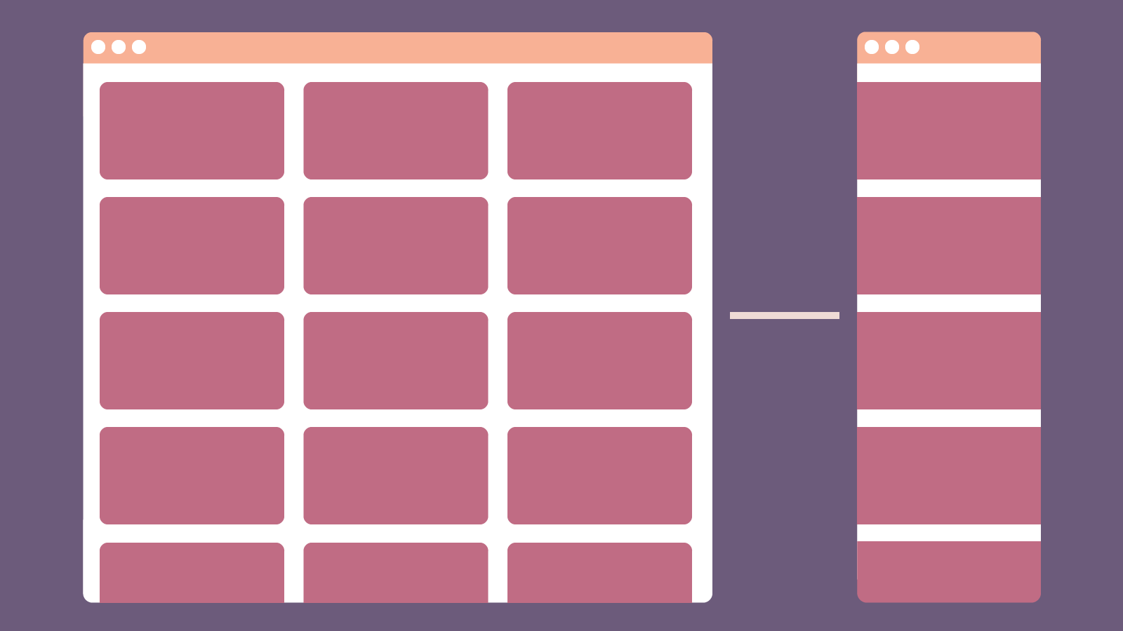
Content-Aware SVG
Plugins like PostCSS Inline SVG have made me pine for a future where SVG is as much a first-class citizen of our presentation as it is our content.
@svg icon-star {
  content: url("/icons/star.svg");
  stroke: currentColor;
  stroke-width: 0.125em;
}

.icon-star {
  background-image: icon-star;
}Code language: CSS (css)Align to Typeface Median
vertical-align: middle aligns an element with the baseline of text minus half its x-height. This makes it a poor fit for glyph-sized elements like icons, which will always look a tad too low. Ideally we’d have a property that would align with the middle of the typeface’s cap height instead.
.icon {
  vertical-align: text-middle;
}Code language: CSS (css)
Borrow Scroll Behavior from Document
It’s easy to make child elements scroll independently of the document. But it would be nice to easily allow “fullscreen” elements like modals and menus to take over as the document’s primary scrolling element.
.menu.is-open {
  overflow: document;
}Code language: CSS (css)Click/Touch Target Sizing
Making elements large enough for our fingers can be more challenging than it seems. It’d be swell if we could manipulate the interactive area via CSS!
.button {
  pointer-box-offset: 0.5rem;
}Code language: CSS (css)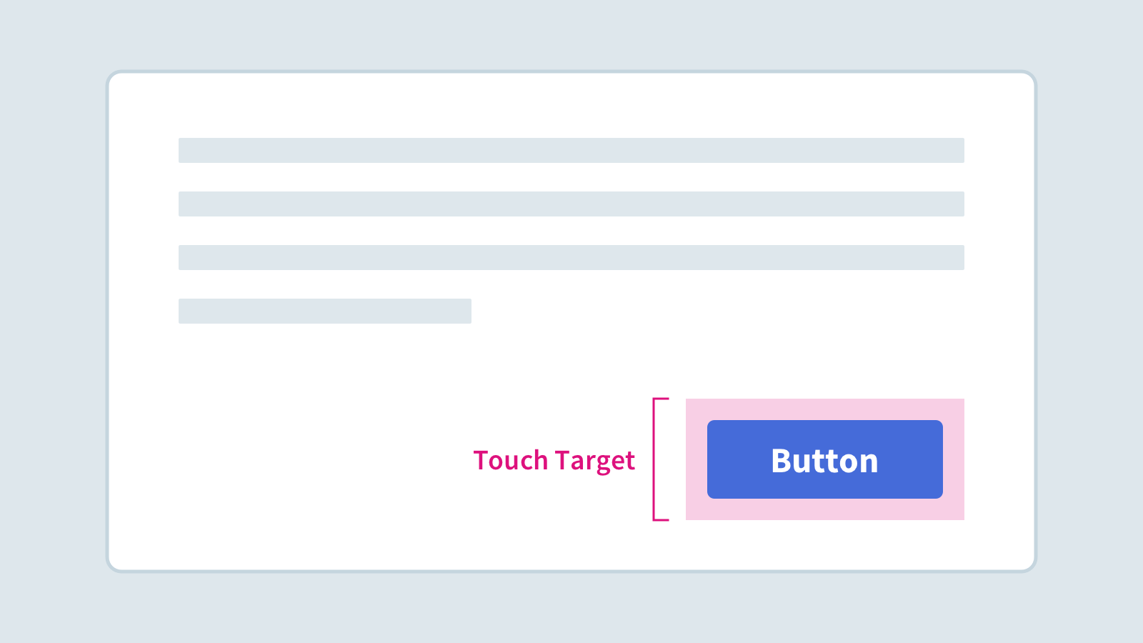
Pseudo Elements Between Siblings
Horizontal navigation patterns like breadcrumbs often include visual separators between each segment. While there are several ways to style these separators via CSS (using pseudo elements and adjacent sibling selectors, for example), a surprising number of websites still hard-code vertical bars or other text characters right in their HTML.
Maybe what we need is a simpler way to inject content between adjacent elements instead of just before or after?
.breadcrumbs > *::between {
  content: "▸";
  margin: 0 2ch;
}Code language: CSS (css)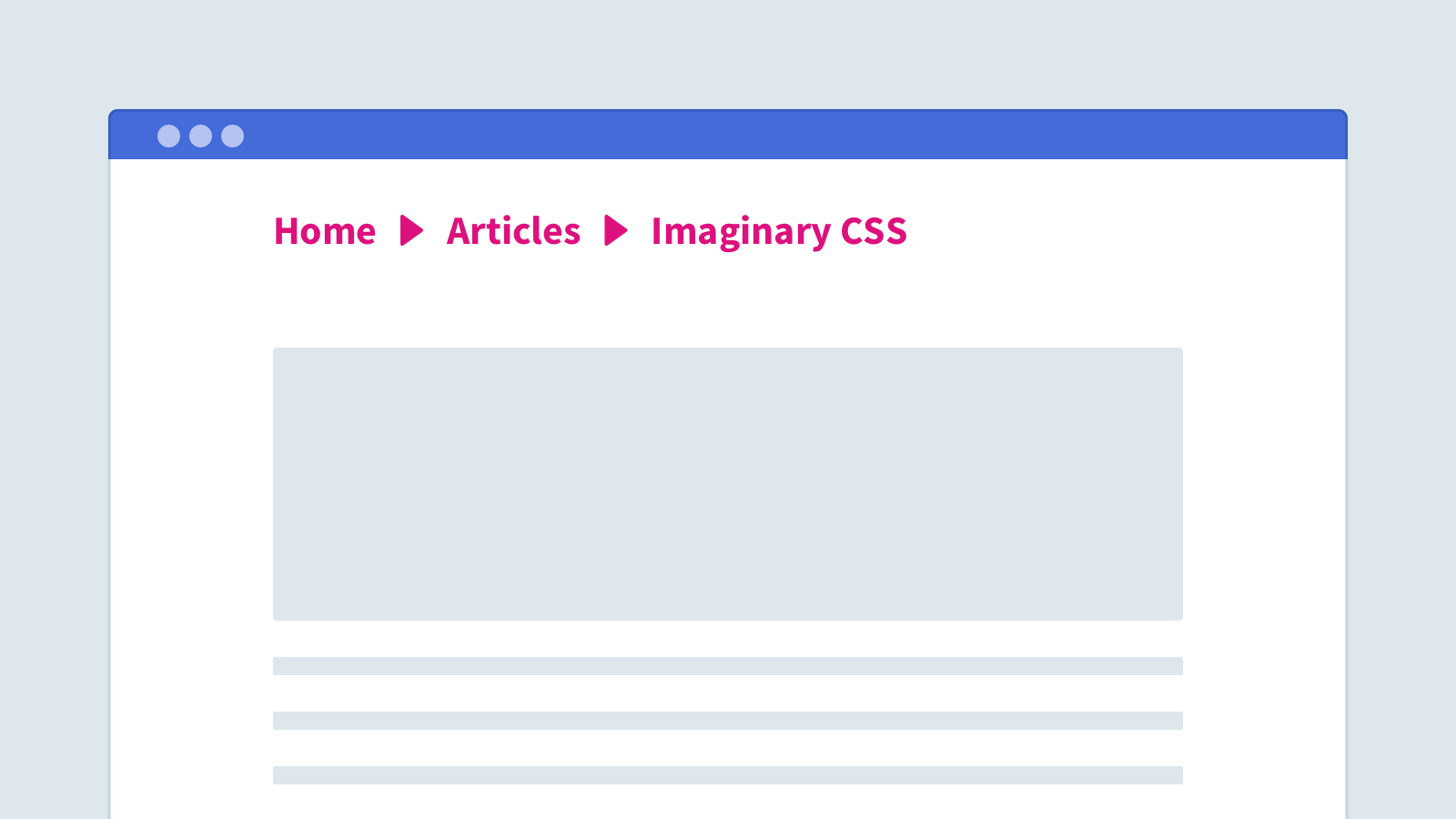
Easily Style Form Affordances
It feels a little silly that we can’t just override <select> arrows and similar details without obliterating them entirely.
select::expand {
  content: url("icons/arrow-down.svg");
}Code language: CSS (css)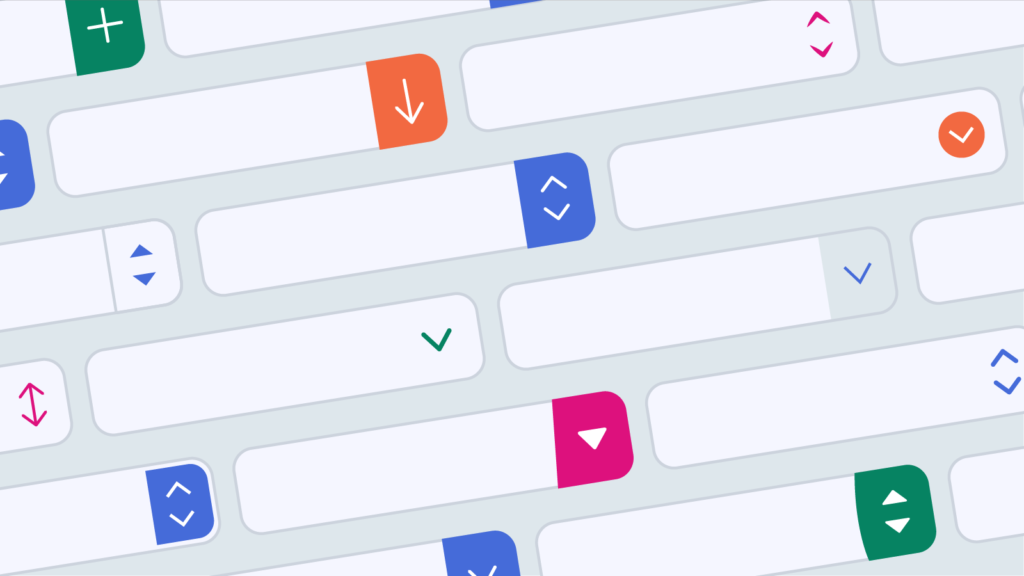
Optical Margin Alignment
Something I always miss from my graphic design days is the ability to automatically align quotation marks, uppercase “T” characters, etc. slightly past the box margin so they appear more visually balanced.
body {
  text-align: optical left;
}Code language: CSS (css)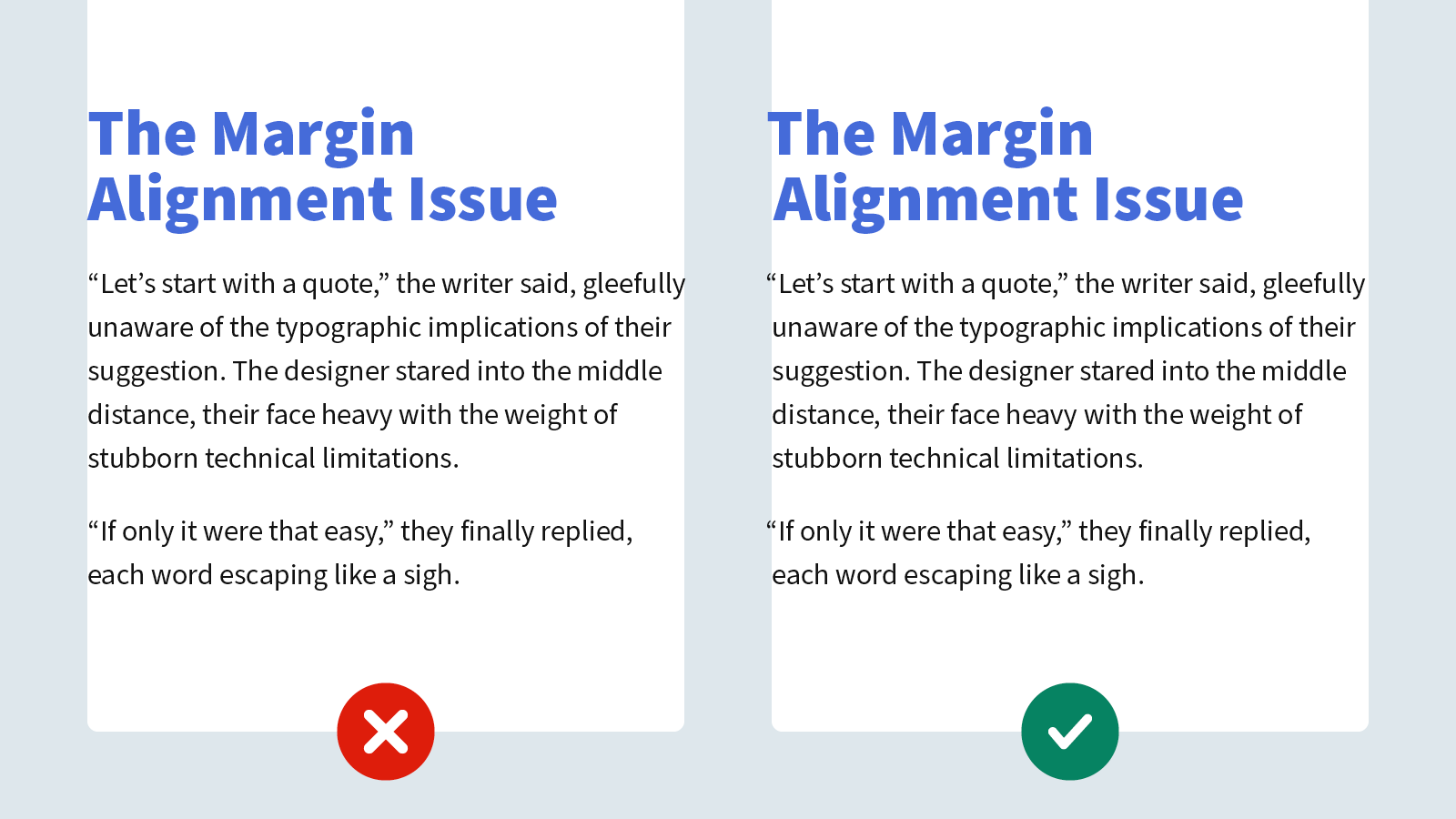
Update: Amelia Bellamy-Royds helpfully pointed out that this may be partially addressed by the hanging-punctuation property. It’s only supported in Safari as of this writing, but it looks like a promising step!
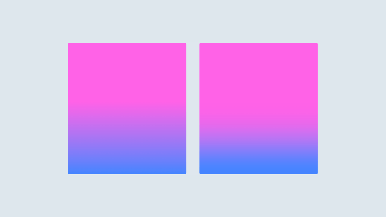
Eased Gradients
Gradients can look pretty gnarly in browsers without some easing applied! Crossing my fingers that this eventually makes it into the CSS spec.
.example {
  background-image: linear-gradient(to bottom, cubic-bezier(0.455, 0.03, 0.515, 0.955), #456BD9, #F14CA3);
}Code language: CSS (css)