The Power of Responsive Design Sprints
At 4/19/2024
In 2008, I sat gobsmacked in Web 2.0 Expo session. The topic of M. Jackson Wilkinson‘s presentation was “Design and User Experience in the Agile Process“, and I literally couldn’t imagine designing that way.
Fast forward seven years, add responsive design to the mix, and I can no longer imagine designing any other way. Responsive Design Sprints are key to our process.
Why agile for design?
Our path to agile for design started with moving to agile for development. Lyza and Megan spearheaded a move to agile development a few years ago and that change influenced the way we looked at projects.
Because of our success using agile for development, we were primed to try it when responsive design broke our existing design process.
We’ve found that agile design is ideally suited for designing responsive patterns. It allows us to focus on small pieces of a design and iterate on them quickly.
What is a Responsive Design Sprint?
Most of the time when people talk about design sprints, they’re referring to product design sprints. This is the process that Google Ventures, our friends at Fresh Tilled Soil and others have developed and promoted as a way to quickly validate product design and direction.
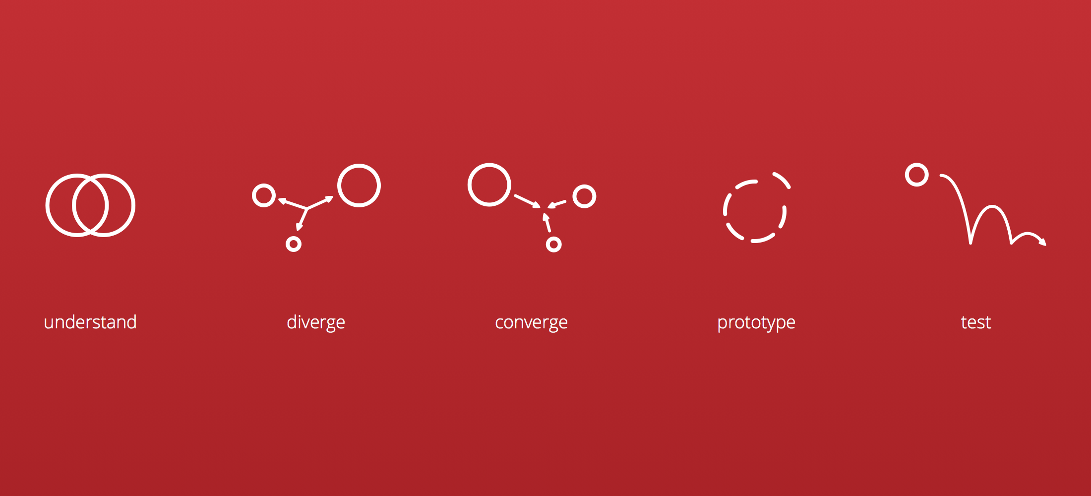
Product design sprints are an exceptionally useful tool. The phases in our sprints have some similar characteristics—you’ll see parallels to the Understand, Diverge and Prototype phases in particular.
However, Responsive Design Sprints are decidedly different in what they’re trying to accomplish and diverge from Product Design Sprints in some specific ways.
Pre-sprint planning
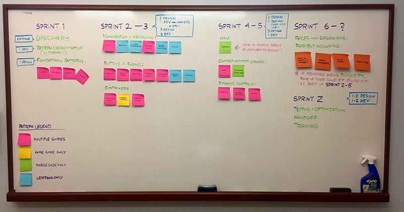
Our first step when planning a project is to break the site down into the patterns—from the lowest level to higher-level components—that we need to design.
This is our starting position for each sprint, but because we’re working in an agile fashion, we’re flexible and can change what patterns are being worked on. We can also spend more time on patterns or bring patterns in from later sprints if we’re ahead of our plan.
Before each two-week sprint, we collaborate with our clients to figure out what patterns will be covered in the upcoming sprint. This not only allows us to confirm that our priorities are correct, but it also gives our clients a heads up on what they need to prepare for the sprint kickoff.
Sprint Day 1 — Client briefing and small screen sketching
Client briefing
Each sprint starts with a briefing on the patterns for that sprint. This briefing is led by the client team.
During the briefing, the client team provides everything they know about the patterns including:
- How the patterns are used.
- Any edge cases for the patterns.
- Analytics information on the patterns.
- User testing that has been done.
- Support or user feedback on patterns.
If we’re dealing with foundational patterns like typography and buttons, the briefing could simply be going over any existing brand and style guidelines.
However, when we start working on more complex patterns—for example a shopping cart interface—there is often quite a bit of information about the pattern to convey.
Small screen sketching
After the briefing, we start group sketching sessions. Ideally, we do this with our client, but often we work with teams in other parts of the world so we only get to sketch together a couple of times during a project.
Everyone participates in the sketching irrespective of roles. Sketching small screen designs helps people start thinking more tangibly about the constraints of small screens. It is one of the reasons why we include clients in sketching exercises whenever we can.
We pick the portions of the patterns that we think are going to be the most difficult to fit on small screens and sketch those. This often means that we’re not sketching the entire interface or even the entire pattern that we’re looking at, but instead just a small portion of the pattern that looks particularly troublesome.
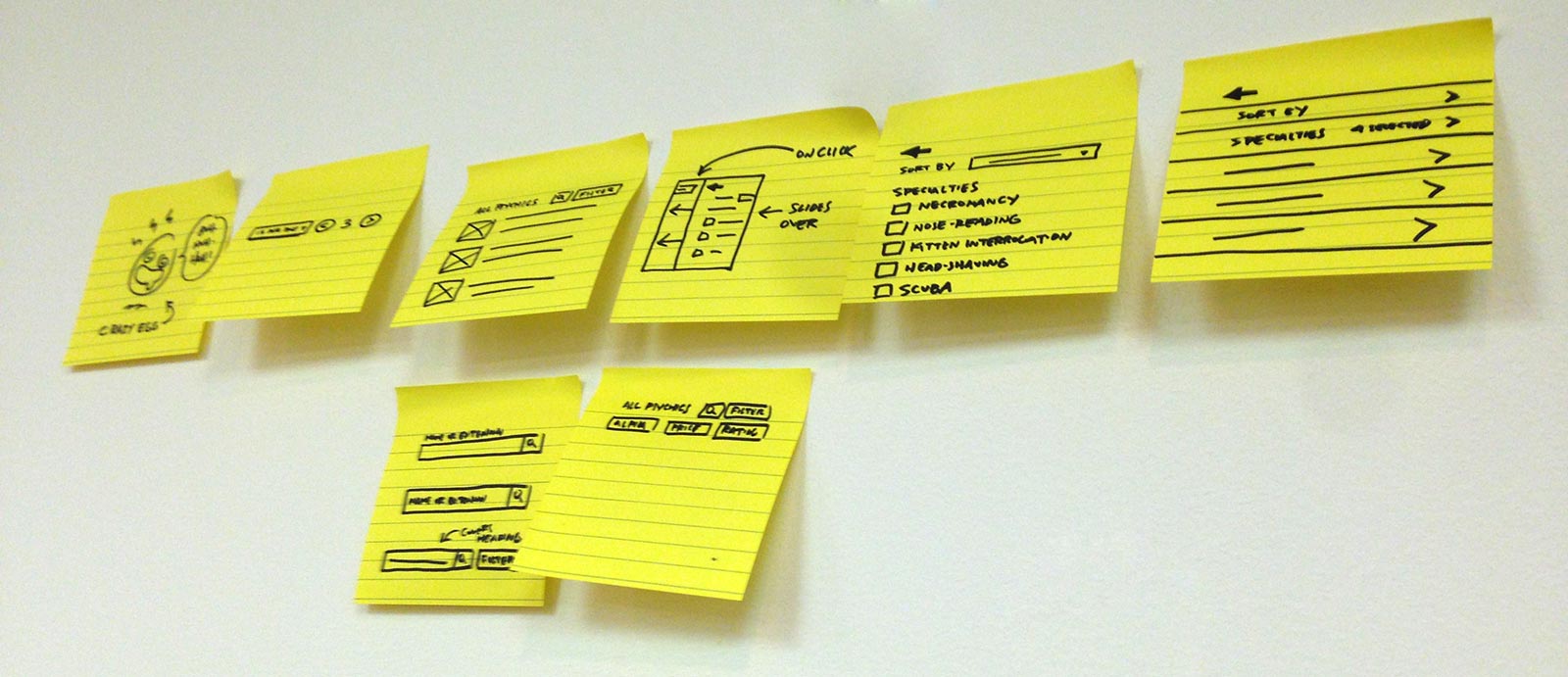
We sketch on small sticky notes using Sharpies. Every sketching session is time-boxed. The constraints on time, size and low fidelity markers prevent people from getting too detailed in their drawings.
And we use Sharpie brand markers because Tyler is a marker snob.
(Tyler here: The store-brand ones bleed too much!!)
Each person posts their sketches on the board and talks about what they saw and how they were trying to solve the problems. The conversation around the sketches is just as important as the sketching itself.
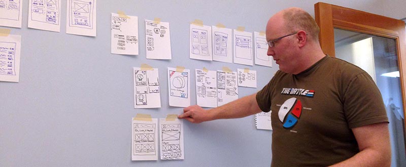
The goal of the sketching session is to give the designers some ideas on how they might solve the problems that the patterns represent. We do multiple sketching sessions until people feel they have enough material to explore.
Focus on small screens first
For most of the sprint, we focus on small screens. We’re often asked how things will work on wider screens early in a sprint, but we try to resist thinking about that yet.
If you’ve managed to organize your life to fit inside a New York City apartment, you’re not going to have any trouble adjusting to a big house in the suburbs. The same is true of responsive designs.
If you nail the small screen design, the larger sizes will be easy by comparison.
Sprint daily activity — Quick design iterations
We move immediately from sketches to testing our ideas in the browser. We create quick prototypes of the designs that we then share with the client team in Slack.
The video above shows collaboration happening on day 2 of a new project. We’re showing simple small screen designs in the browser and getting feedback both from our co-workers and the client team.
Often, we will have members of the client team working on patterns as well. They may be sharing mockups, photographing sketches, or even coding prototypes.
What matters most is that we’re sharing ideas quickly and iterating towards better solutions.
LICECap, the worst named, best tool ever
One of the advantages of designing in the browser is that we’re able to demonstrate how things should interact. But when we’re working with distributed teams, we need a tool to show the interaction.
That’s where LICECap comes in. LICECap makes it easy to capture screen video and save it as an animated gif.
So instead of saying to a client, “imagine we hide all of the controls behind a single button until someone clicks on it” and hoping that the client understands, we simply post an animated gif in Slack.

The animated gif eliminates confusion and facilitates quick feedback.
Mid-sprint review meetings
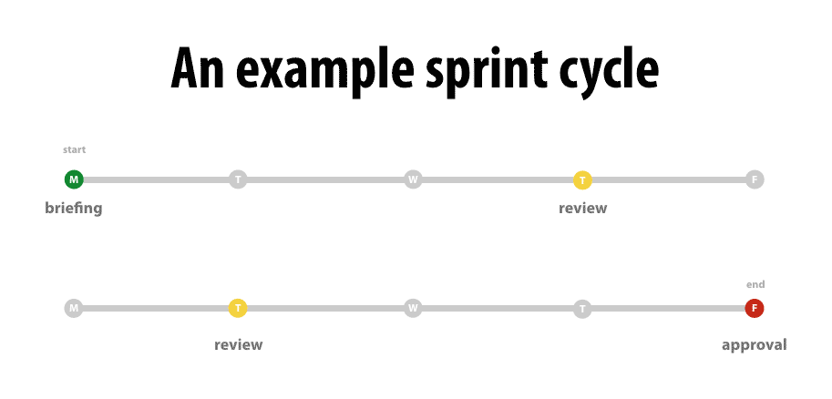
The amount and frequency of review meetings in a sprint change from project to project, but generally we’ll have one review meeting late in the first week of the sprint to make sure we’re on the right track.
We share our screens and show any in-progress work. Those who have been active in our shared Slack channel will have seen most of the work already, but the meeting ensures that all stakeholders are looking at the patterns early in the sprint.
Depending on the complexity of the pattern, by the second review meeting we’ll have examples of how the pattern will adapt as the screen size increases.
End of sprint review
At the end of the two week period, we have one final meeting to review the progress on the patterns tackled during the sprint. Nothing in this meeting should be a surprise because we’ve been sharing our work throughout the sprint.
After we’ve reviewed the patterns, we talk about what worked well during that sprint and what we could improve on for the next sprint. We’re not only iterating on the designs, but on the process itself.
This isn’t rocket science, but it feels new just the same
Nothing I’ve described here is new.
Agile processes have been around for years. Many people have talked about how responsive design makes pattern libraries more important than ever.
But the combination of responsive design, patterns libraries, sprints, gifs, and constant communication via Slack creates a radically different design process. Even if the pieces that comprise them aren’t new, Responsive Design Sprints certainly are.
Most importantly, Responsive Design Sprints work exceptionally well.
They helped us convert complex interfaces that seemed insurmountable. When we were asked to convert an e-commerce design to responsive in only three months, it was Responsive Design Sprints that helped us move quickly and finish the project a week ahead of schedule.
I can only imagine how stunned 2008 me would be to see what our design process looks like now.

