Tips for Portable Patterns
At 4/19/2024

One of the promises of design systems is portability. Every new project should benefit from the patterns and principles of the previous… why reinvent the wheel each time? But accomplishing that can be tricky when it comes to HTML, CSS and JavaScript patterns.
Teams that maintain a consistent technical stack have it easier in this regard. Maybe they only develop a single product, or maybe they mandate usage of a framework they’ve invested in. Whatever the reason, their strategy seems clear: Write HTML, CSS and JavaScript for patterns as you would any project code.
But many organizations have a much more varied ecosystem. Maybe their main product was built a few years ago with Ruby on Rails and jQuery, but there’s a new skunkworks project they’re testing that’s a PWA built with isomorphic JavaScript. There’s also the static marketing site, the WordPress blog, the help center, and so on, and so on…
As technology continues to change and we uncover new user needs, it’s no wonder that our platforms and techniques often evolve from project to project. In lieu of psychic ability or a crystal ball, what strategies can we adopt to improve the portability of our front-end patterns between seemingly disparate platforms?
Separate Concerns Per Component
HTML, CSS and JavaScript are the basic building blocks of the web. But different platforms care about and process these building blocks differently. Server-side languages like PHP and .NET introduce templates for rendering dynamic HTML while imposing few (if any) requirements on CSS and JavaScript. Frameworks like React, Vue or Svelte may include their own rules or syntax for content, styles and behavior depending on a project’s configuration.
Consider organizing your patterns so that each has its own distinct template, CSS and vanilla JavaScript source files:
patterns
└── example
    ├── example.css
    ├── example.js
    └── example.hbs
Code language: CSS (css)
This gives you the freedom to concatenate assets for traditional web projects:
@import "config.css";
@import "typography.css";
@import "patterns/example/example.css";
Code language: CSS (css)
import { ExamplePattern } from 'patterns/example/example.js';
document.querySelectorAll('.Example').forEach(
element => ExamplePattern(element)
);
Code language: JavaScript (javascript)Or to leverage the parts that make sense in a more opinionated structure:
<template>
  <div class="Example" ref="element">{{label}}</div>
</template>

<script>
import ExamplePattern from 'patterns/example/example.js';

export default {
  data() {
    return {
      label: 'Hello'
    }
  },
  mounted() {
    ExamplePattern(this.$refs.element);
  }
}
</script>

<style src="patterns/example/example.css"></style>
Code language: HTML, XML (xml)
Patterns, like songs, are easier to remix when each master track is separated. Footnote 1
Keep CSS Components Self-Contained
HTML represents content, so it’s inherently prone to change. JavaScript represents behavior, which changes moment to moment based on user action. So it’s no accident that CSS is typically the cornerstone of any pattern library: If thoughtfully authored and maintained, it can be the most consistent and reliable of our basic building blocks.Footnote 2
In terms of portability, CSS components are often held back by being overly dependent on other components or utilities. Ideally, any one CSS component should be able to serve its basic purpose even if the rest of your project’s CSS was removed.
To be clear, tiny re-usable utility classes are still a great idea. But even the creator of Tailwind CSS, one of the most popular utility-based frameworks, thinks “you should still create components.”
Document States (Even Fleeting Ones)
It’s common to document the various states of interactive patterns like buttons. What’s less common is to document any transient states that may occur temporarily, like those representing steps of an animation.
Let’s consider a hypothetical drawer pattern. It has two main states, open and closed:
But under the hood, it’s probably more complicated than that. There may be “start” and “end” states for opening and closing animations, and those may be distinct from the “fully closed” or “fully open” states. There may be accessibility considerations, like adding or removing hidden or inert properties from certain elements or restricting animation based on motion sensitivity preferences.
Documenting those stepsFootnote 3 helps preserve those considerations across platforms. It may also expose opportunities for developers to re-use existing transition classes instead of starting from scratch.
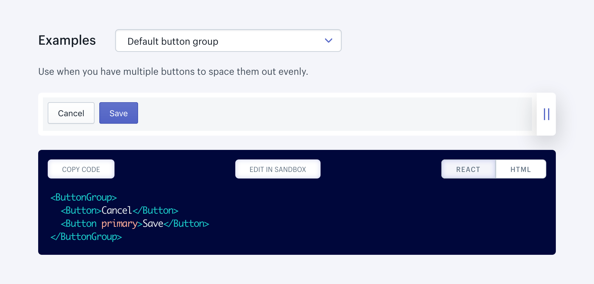
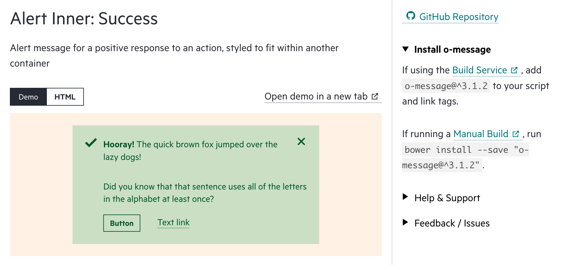
Show Multiple Code Samples
It’s easy for our style guides to become biased toward whatever platform we used to construct them. Serving up alternate code samples often requires extra effort, testing and review. It can feel like a lot of extra complexity to account for what may feel like “secondary” experiences.

But that mentality does both your team and your patterns a disservice. Showcasing alternate code samples encourages cross-platform usage and reminds contributors of the potential scope of their changes.
Simplify Inclusion
Copying and pasting code over and over isn’t just repetitive and irritating, it can make maintenance a real chore. How to best minimize that effort depends on the needs of your team and projects.
For large projects or quick proofs of concept, it’s hard to beat the convenience of having a single CSS and JavaScript bundle for your entire pattern library. But having everything at once is often overkill.
It may make sense to allow for custom bundles to be generated, via a tool (see Zurb Foundation for Sites) or service (see The Financial Times’ Origami).

With many projects these days including their own build steps, we’re fans of exposing individual components via an npm package. Projects like Lerna can even let you version components individually within the same repository.
Sharing component HTML with traditional server-side platforms like PHP and .NET is often the greatest challenge. We’ve had success defining patterns in a template language that works across platforms (Liquid, Handlebars, Twig, etc.), though it takes a bit of effort to set up the integrations and scare out any inconsistencies between implementations. Footnote 4
Why Bother?
The business case for design systems may seem cynical on its surface: “Stop wasting time and money designing the same buttons over and over!” But that’s an oversimplification. The best systems don’t simply reduce effort, they empower teams to focus their energy on addressing user needs in true collaboration. It becomes a lot simpler to prioritize accessibility enhancements, readability tweaks and performance improvements when you’re starting from a flexible and robust foundation.
Portable patterns take it one step further by freeing that cumulative effort from any one project or platform.
Footnotes
- Some organizations may be able to fully embrace web components now that resources like Stencil exist to simplify server-side rendering (see this wonderful article explaining how to get started). Unfortunately, the integration path for web components isn’t as clear for traditional server languages like PHP or .NET. There are also some other potential issues with web components it helps to be aware of. Return to the text before footnote 1
- That’s not to say it isn’t important for everything to be self-contained (see the “Self-Contained” section of the Design Systems Handbook’s third chapter). But organizations often under-emphasize CSS quality control, even when CSS is the only easily shared resource between projects. Return to the text before footnote 2
- If you’re new to including animation in your style guide, this article by Val Head is a great starting point. Return to the text before footnote 3
- For new projects, you can simplify integration by adopting an isomorphic JavaScript solution, where the same JavaScript powers the front-end and back-end. Return to the text before footnote 4
